Robots are out to get us! Okay, maybe not just yet. For now, it seems, they'll content themselves with taking our jobs.
Scared? Maybe you don't have to be. Take a look at the Rise of the Robots webpage to find out. Or don't. Ignorance is bliss, after all.
Still, this whole situation seems terribly unfair, especially when you realize that most healthcare employees are going to be totally fine. The thing is, you can't simply program emotions and behaviour into an artificial brain (yet).
But wait, what if you're a healthcare professional yourself?
Good for you, then! You're going to be more than all right.
According to the U.S. Bureau of Labor Statistics, the overall employment in healthcare occupations is projected to grow much faster than the average for all occupations from 2023 to 2033. About 1.9 million openings are projected each year, on average, in these occupations.
In spite of that, getting a job in healthcare is not always easy. To help you out with that, we've put together 10 awesome healthcare resume samples.
Oh and some of them even belong to real people who already scored a job in healthcare.
- 1. Physical Therapist at Houston Methodist: Resume Sample
- 2. X-Ray Technician at Tarpon Orthopedics: Resume Sample
- 3. Clinical Project Manager: CV Sample
- 4. Hospice Care Nurse: Resume Example
- 5. Dental Assistant: Resume Sample
- 6. Cardiac Nurse: Resume Example
- 7. Nurse Anesthetist: Resume Example
- 8. Dermatologist: Resume Sample
- 9. Certified Nurse Midwife: Resume Sample
- 10. Dentist: Resume Sample
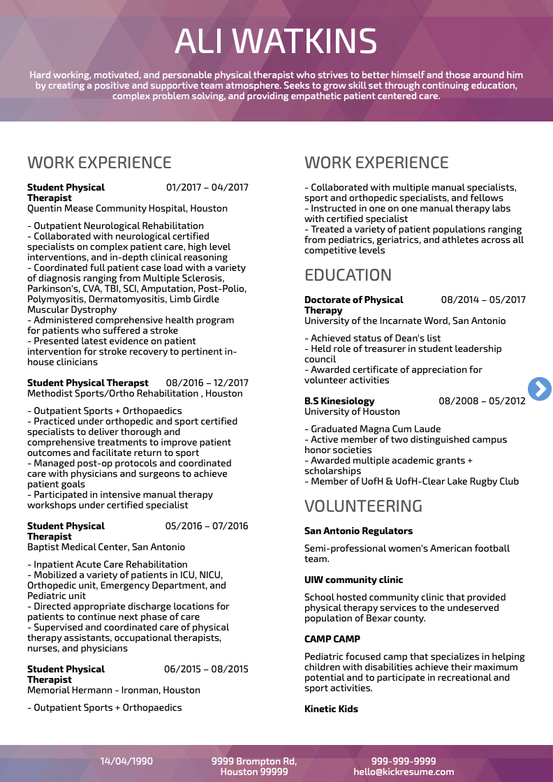
1. Physical Therapist at Houston Methodist: Resume Sample
What works: It's packed with relevant keywords, straight-to-the-point bullet points, and easily demonstrable achievements. We're always happy to see that—and hiring managers are too.
How to improve it: See for yourself how unnecessarily long it is. Come on, just click on it (not a clickbait 😅).
Sure, this resume is already good enough. After all, it helped someone score a job as a physical therapist. On the other hand, it would have worked even better if it fitted on a single page.
Also, the bullet points. Well, they aren't really bullet points, are they? No, every single one of them is the minus.
When writing lists, you should always use bullet points or dashes. Also, don't forget to separate the individual items with semicolons. (Or periods if you're feeling a bit cheeky.)
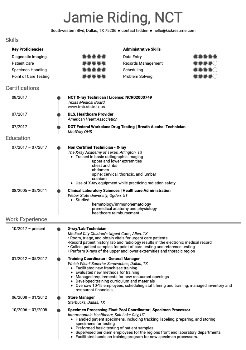
2. X-Ray Technician at Tarpon Orthopedics: Resume Sample
What works: Contrary to the previous resume, this one fits on a single page. Yay.
Also, even though it lists the candidate's full employment history, it only elaborates on the most relevant jobs. In this way, it doesn't swamp the potential employer with unnecessary information.
How to improve it: Yet again, this resume helped someone score a job as an X-ray technician. That alone makes it good enough (Congratuwelldone! 🥳).
Still, you could improve it by removing skills like problem solving, scheduling, or patient care from the list. If you're applying for a job as an X-ray technician, these go without saying.
At the same time, we'd recommend rearranging the sections a bit. For instance, this particular job seeker can boast a lot of experience in the field. Because of that, we'd recommend putting the work experience section first, then education, and skills last. Your greatest strengths should always come first.
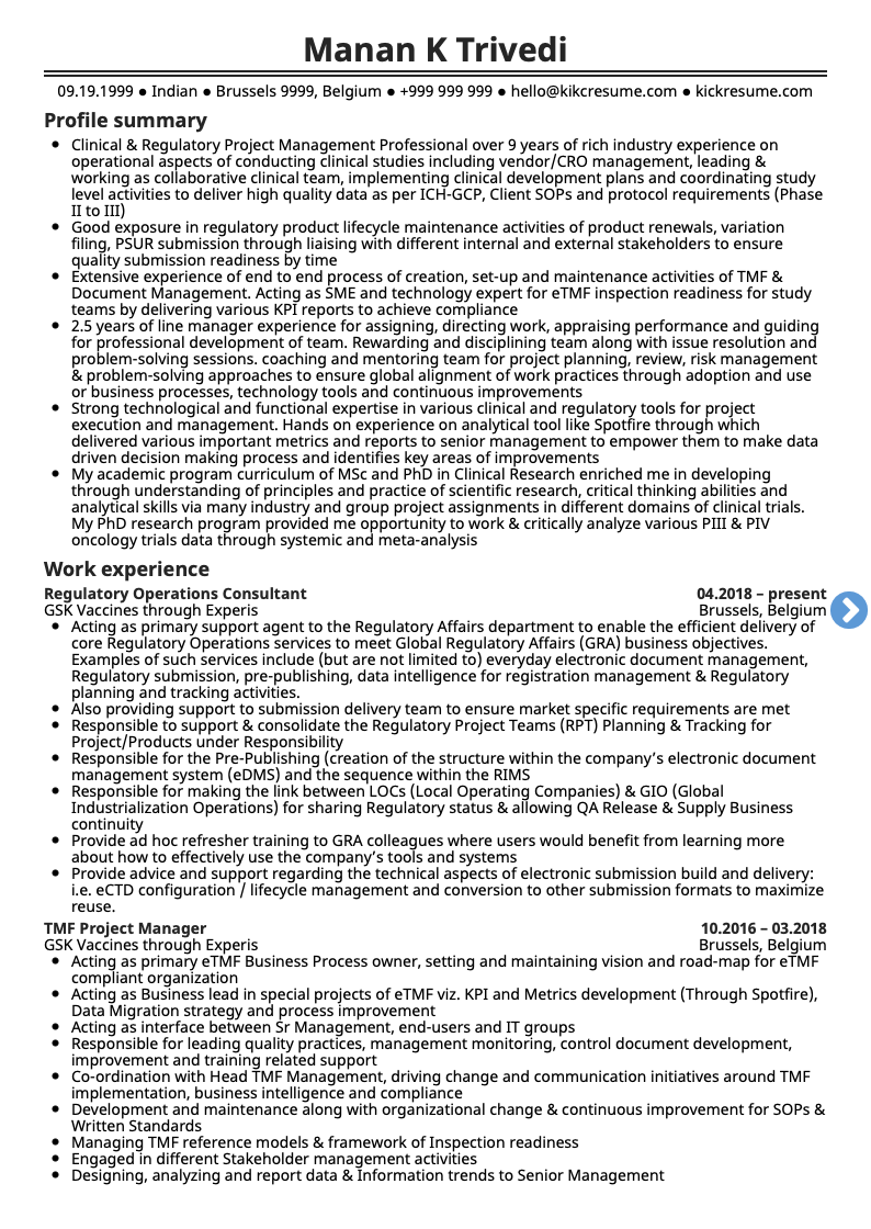
3. Clinical Project Manager: CV Sample
What works: Whoa! This one's certainly not afraid to go into great detail. And no, it's not just the one page you can see below.
With the length of four pages, we even hesitate to call it a resume. But what makes for a terrible resume, can make for an excellent CV. Let's call it a CV then!
What's the difference then? A resume is supposed to attract attention to your most relevant and notable accomplishments. A CV, on the other hand, is an exhaustive account of your employment history.
And if the document below isn't exhaustive, I don't know what is. 🤨
How to improve it: Although a CV is supposed to be detailed, this one is probably going a bit too far. Try to read all four pages of it, I dare you!
In the end, however, it's not the length that makes it difficult to read. It's the formatting.
The text simply doesn't have enough space to 'breathe'.
As you can see, you should never underestimate the power of proper padding, line height, margins, and font size.
Having said that, you should probably also know that this guy did get the job. Who are we to judge, then?
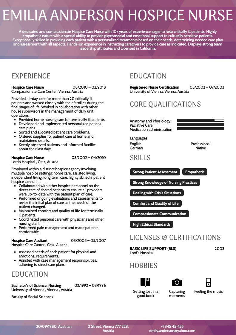
4. Hospice Care Nurse: Resume Example
What works: The way it looks. And by that, we don't mean the purple something at the top of the page.
No, how it organizes information has a much bigger impact.
First, it makes you remember the resume.
Second, it makes the text read well. Look at how easily you can follow each section. Thanks to that, the hiring manager, too, will be able to find the most important information fast.
How to improve it: A dedicated achievements section would certainly help to elevate this one. If these achievements were also expressed in numbers, even better.
After all, the best way to impress a hiring manager is to tell them about how you solved a challenging problem in the past.
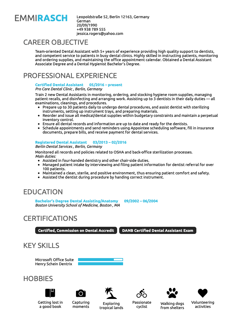
5. Dental Assistant: Resume Sample
What works: Clean, straight-to-the-point and visually pleasing. In healthcare, you probably don't want your resume to look too creative. A minimalist design, such as the one below, is more than enough.
How to improve it: For the most part, this resume is good. Let's take a look at something really minor then.
The hobbies section. See that volunteering icon at the very end? If you do volunteer work regularly, then you should almost always put it on your resume. Not enough space? Ditch the hobbies section, for instance. What you actually do is always more interesting than what you like to do.
Oh, and one more thing. See that "Main duties:" line under the second job? That's completely redundant. Leave it out.
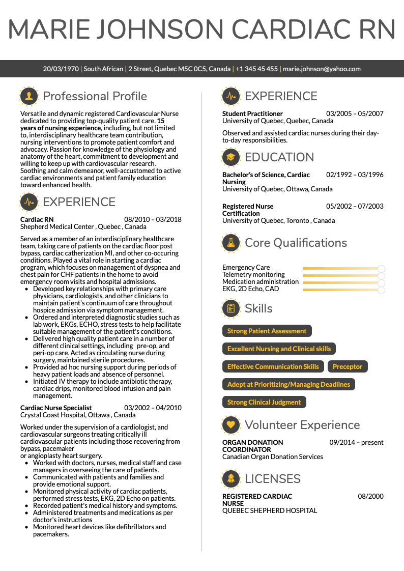
6. Cardiac Nurse: Resume Example
What works: Great profile section. See how it uses bold text to emphasize the years of experience?
This job seeker also took on a less formal tone of voice. Sure, it's not always a good idea to pour your heart out on a resume. But in this case, it was done with good judgement and shows the job seeker's passion for the job.
How to improve it: We found it a bit difficult to navigate the individual subsections. For instance, the profile section can be easily divided into multiple bullet points to remedy this. Remember, everybody hates reading a 'wall of text'.
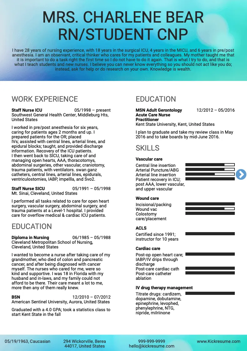
7. Nurse Anesthetist: Resume Example
What works: The skills section dominates the page. Which is great if you want to emphasize your skills.
What's more almost every section is packed with keywords, acronyms, and industry lingo. What's more, in a nurse resume, this works surprisingly well.
How to improve it: Similarly to the previous resume, this one would also benefit from a more generous use of bullet points. Or more careful formatting in general.
The skills section, even though it does many things well, could benefit from a more regular placement of words and progress bars.
Finally, although we praised the personal tone of the previous resume, we hesitate to do it with this one.
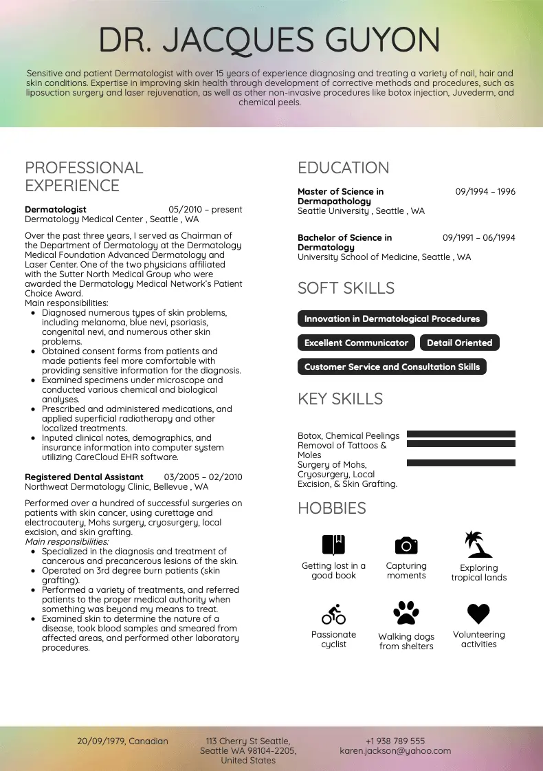
8. Dermatologist: Resume Sample
What works: Although the work experience section claims to list responsibilities, the fact that it's written in the past tense slightly mitigates it. Remember, you always want to list achievements, not responsibilities. On the other hand, the past tense can make even responsibilities sound a bit more 'accomplished'.
Also, this resume is visually balanced, which makes it immediately attractive and rememberable.
How to improve it: Remove the redundant 'Main responsibilities' headlines.
The hobbies section could be easily removed in favor of a more expansive work experience section.
The profile section opens in a weird way ('sensitive and patient' sounds a bit peculiar).
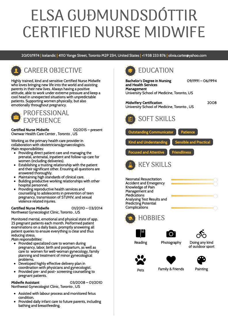
9. Certified Nurse Midwife: Resume Sample
What works: Pretty much the same things that work for the previous resumes. Let's not repeat ourselves.
How to improve it: Remove the "Main responsibilities" headlines and the hobbies section is unnecessarily extensive.
Several bullet points inside the experience section are somewhat vague. "Building productive working relationships with other hospital personnel"? Although nice, this line adds nothing to your resume. Things like these go without saying.
10. Dentist: Resume Sample
What works: Professional minimalist template. Quantified achievements (5,000 patients, 95% dental readiness, etc.).
How to improve it: Yet again, we're not sure about the hobbies.
Also, would you go to a dentist who isn't 100% expert at "Soft Tissue Management", but excels in teeth extraction? Sounds a bit scary to us.
Planning to land a healthcare job that robots can't snatch? Let's get you ready with a top-notch resume. Use our AI resume builder to easily create a resume that highlights your unique skills.
Still not enough? If you want to see more examples from real professionals, check out our Resume Examples Library!
