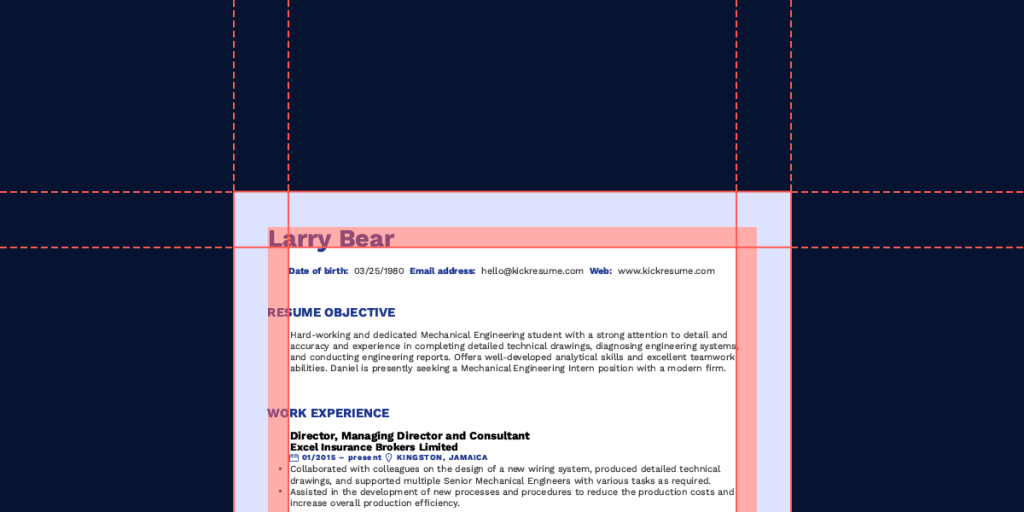
Crafting a great resume isn't just about having great content but also about knowing how to format it. Resume margins are a seemingly unimportant element of building a CV, however, there’s more to them than initially meets the eye.
What is the best margin size for a resume? What are standard margins for a resume? How much leftover white space is still ok? And how to adjust the resume margins in Microsoft Word/Google Docs?
Keep reading to find out everything about proper resume formatting as well as answers to all of the above.
Resume templates with the best margins
The most important thing is to strike a good balance between not leaving too much white space and not leaving your resume seem cluttered by having too little white space.
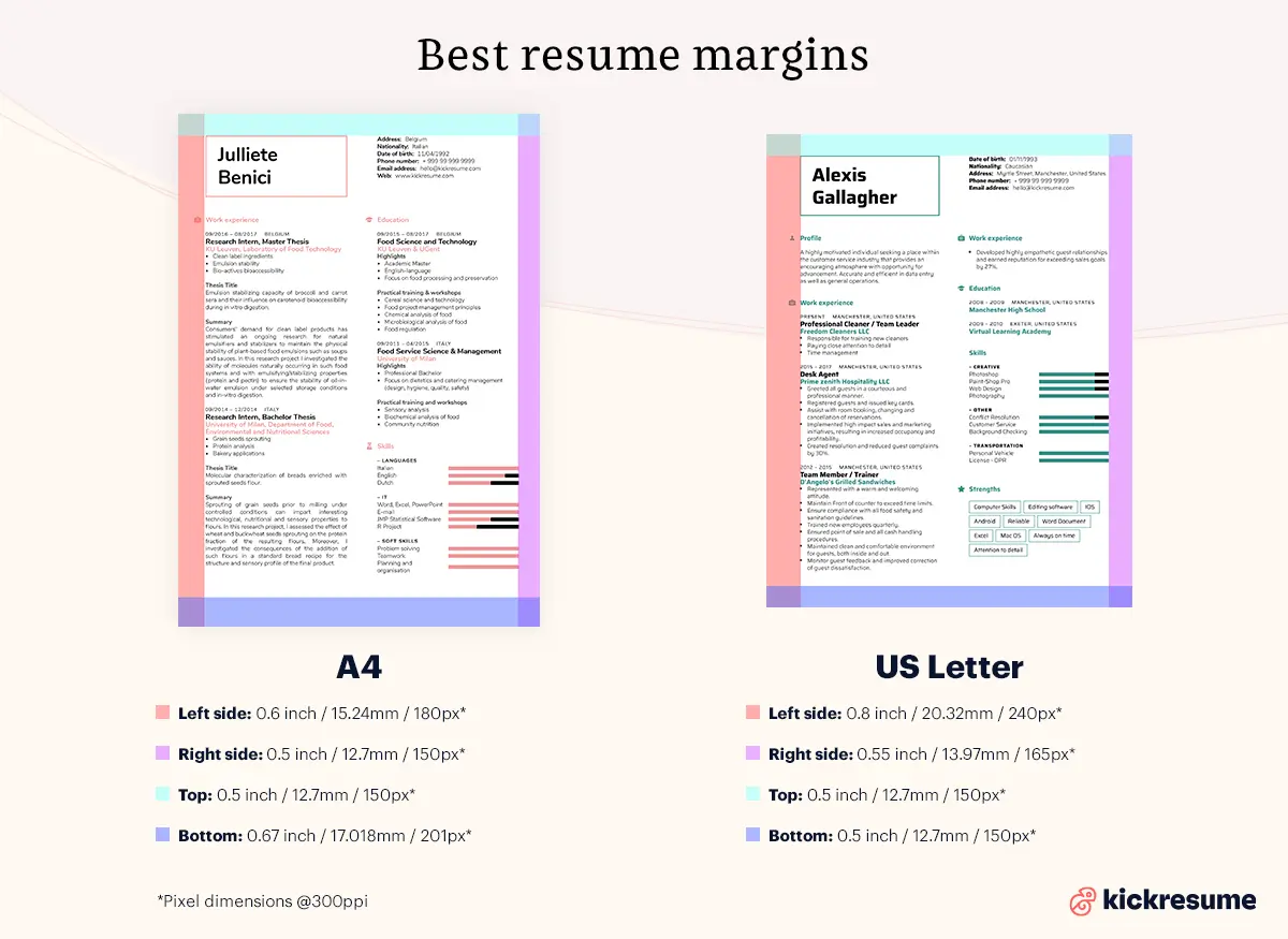
Someone somewhere once decided that default page margins should be 1 inch (2.54 cm) all around. But that leaves relatively little space for text and a lot of white space. Additionally, US letter paper size is a bit different than A4 paper that is commonly used in Europe. Because of these reasons, the 1 inch (2.54 cm) rule is far from universal or internationally accepted.
That's why our resume builder offers resume templates tailored for both US letter and A4 paper sizes, with margins that strike the balance just right. These were carefully chosen by professional typographers and approved by HR experts to create the perfect resume hassle-free and quickly:
- US letter. For the standard US letter paper size we set the margins at 0.8 inch (2 cm) on the left side, 0.55 inch (1.4 cm) on the right, 0.5 inch (1.2 cm) at the top and bottom.
- A4. For A4 sized paper we set margins at 1.6 cm (0.63 inch) on the left side, 1.3 cm (0.51 inch) on the right, 1.3 cm (0.51 inch) at the top and 1.7 cm (0.67 inch) on the bottom.
Have a look at some resume templates that got the margin size balance just right.
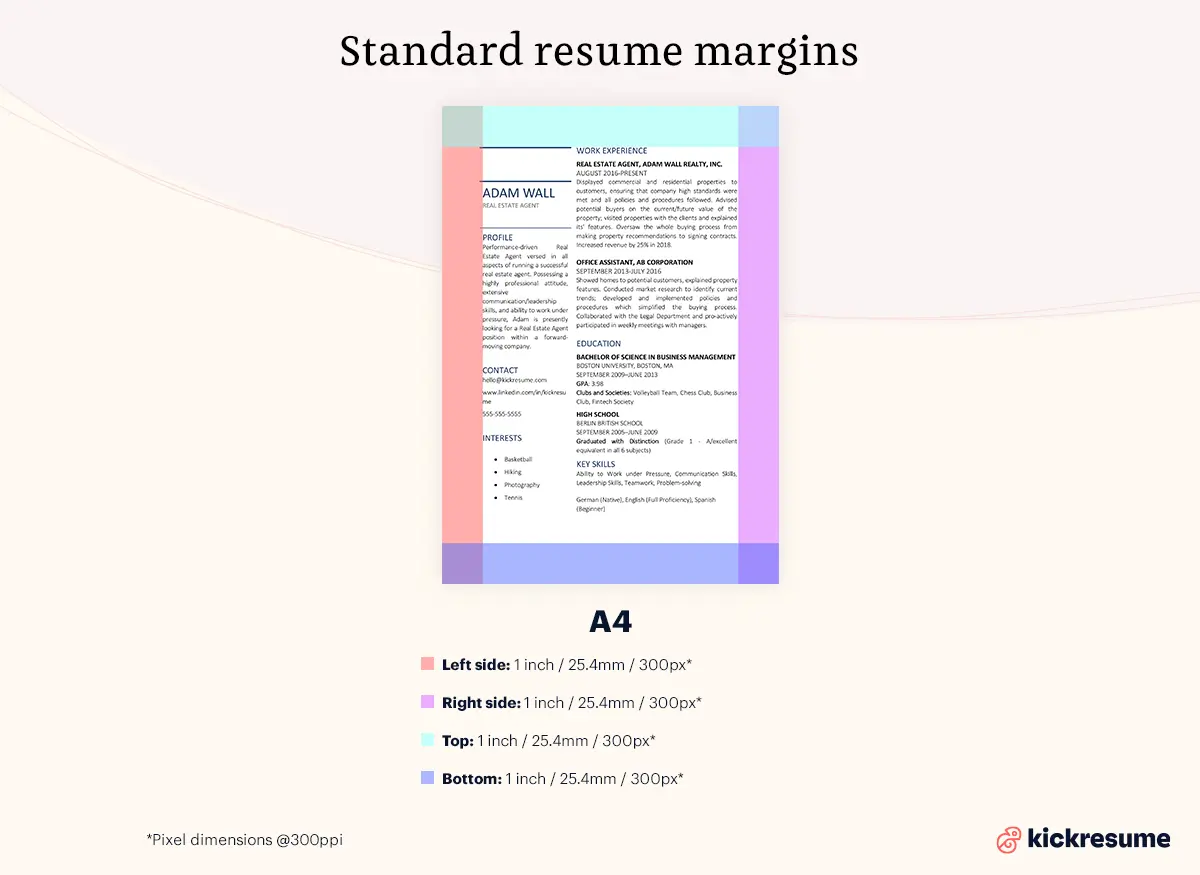
Standard resume margins
As I've already mentioned, it’s often recommended to use the standard resume margin size guidelines when building your resume. This means leaving margins at 1 inch, or 2.54 cm, on each side of your resume — top, bottom and sides.
But is this still relevant nowadays?
Firstly, it's a waste of space. Secondly, you want your resume to stand out. This is why there’s more flexibility with the margin sizes than you might think.
So, how and why can you adjust the margins for a resume? And when you should not do it?
- Reducing. If you find yourself in a situation where you've crafted a great resume but you’re breaking the one page rule by a few extra lines, reducing the standard 1 inch margin could be the solution. Make sure you’re moving between 0.5 inch and 1 inch (1.3 and 2.54 cm), with 0.5 usually being the lowest you should go. Smaller margins will make your CV seem cluttered.
- Increasing. This is generally a no-go. Exceeding the 1 inch margins will create more white space than appropriate, leaving your resume seem empty and of little value. In the next section, Creative resume margins, we're going to discuss an exception to this rule.
- Keep the ratio the same. This means that if you decrease the top and bottom margins, you should decrease the side margins too. By doing this, the resume will be more visually appealing and easier to read for the hiring managers.
- Printing. If you need print versions of your resume, you shouldn’t make the margins too small. As you know, printers randomly act up and you can easily end up with bits of text cut-off from the resume. More details about Best resume margins for printing in a separate section below.
Creative resume margins
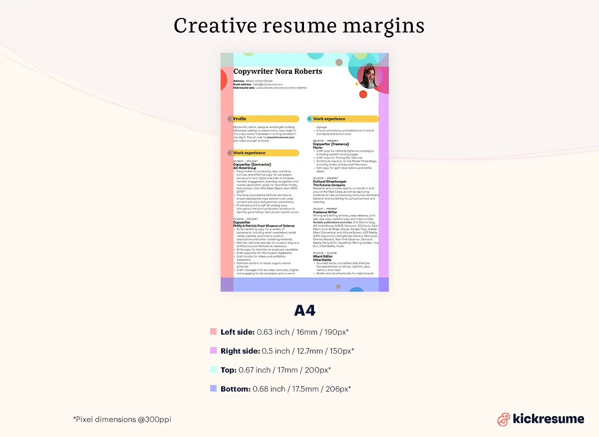
As mentioned earlier, you can be a bit more liberal with the resume margins size if you've decided to make your resume a bit more creative. Anywhere between 0.5 and 1 inch (1.3 and 2.54 cm) is fine. If your resume is very unconventional, you can even go a little under or over.
And yes, creative resumes can be a hit or miss. Sometimes you can get a bit carried away and end up with something that doesn’t even resemble a resume anymore. And that's bad.
However, if done in moderation, you can somewhat increase the chances of your resume standing out from the pile of standard resumes. So, don’t be afraid of getting a little bit more creative to craft your ideal resume!
Here are a few instances where having a creative resume can benefit you:
- Creative industry. If you’re applying for a creative position, such as a graphic designer, it’s actually a benefit if you can showcase your creative side this way.
- Small business. Smaller businesses usually don’t use ATS and your resume is most likely read by a human. They’re also not overwhelmed by piles of applications, hence they have more time on their hands to carefully read each resume.
- Personal taste. If you know the hiring manager’s personal taste and you’re sure that they’ll like it, why not.
Here’s an example of Kickresume’s creative template called Bubbles.
How to change margins on a resume in common text editors
Knowing what the margin size should be and trying to set it up in common text editors can be a tedious process.
Hence, in this section we’ll guide you through the process of changing resume margins in common text editors, step-by-step.
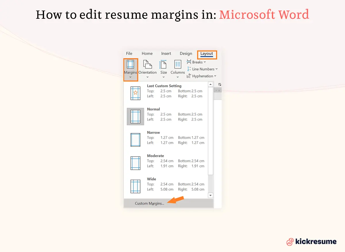
Editing resume margins in Microsoft Word (2010 version)
- Select Layout > Margins.
- Select the margin sizes you want.
- Alternatively, if you want custom margins, follow the path Layout > Margins > Custom margins.
Editing resume margins in Microsoft Word (2003 version)
- From the File menu, select Page Setup.
- Select the Margins tab.
- In the Margins section, adjust the margins as needed.
- Click OK.
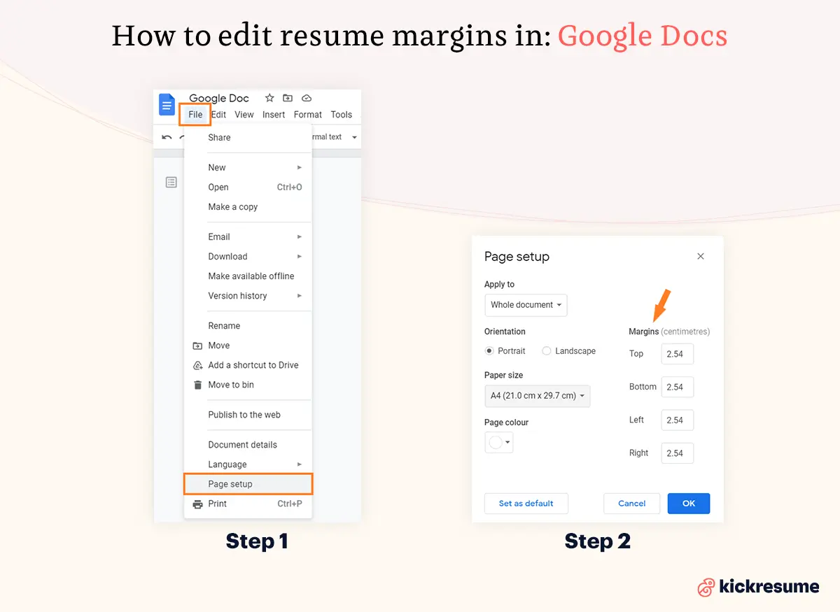
Editing resume margins in Google Docs
- Click File from the menu and choose Page setup.
- Enter the measurements in the boxes under the Margins column for Top, Bottom, Left, and Right.
- Click OK to apply the margin changes.
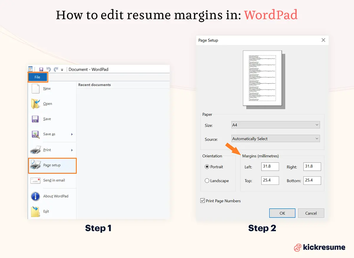
Editing resume margins in WordPad
- Click File, and then Page setup.
- On the Page setup window, you can set the Left, Right, Top, and Bottom margins.
- Click the OK button to set the selected margins.
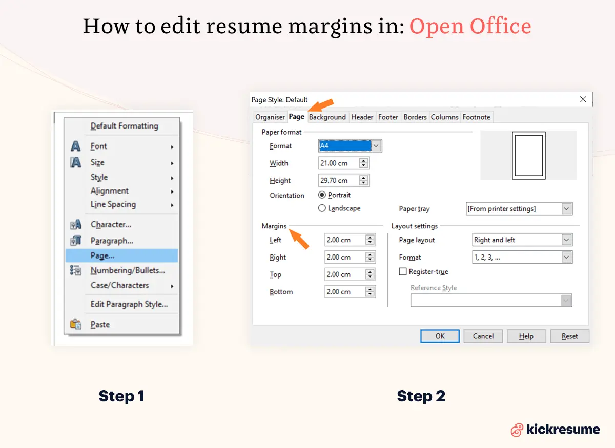
Editing resume margins in Apache OpenOffice
- Right-click anywhere on the page and select Page from the pop-up menu.
- On the Page page of the dialog, type the required distances in the Margins boxes.
- Alternatively, the shaded sections of the rulers are the margins. Put the mouse cursor over the line between the gray and white sections. The pointer turns into a double-headed arrow.
- Hold down the left mouse button and drag the mouse to move the margin.
How to format a resume for better readability?
Ok, you got your resume margins just right. But what else can you do to improve your resume's readability?
- Text alignment. The most naturally appealing text alignment for the (Western) human eye is alignment to the left. This is because when it's time to move on to the following line of text, the eye naturally returns to the left margin. Furthermore, if you want to visually separate a block of text, such as a date or a location, you should align them to the right.
- Font style/size. Choose a simple typeface that isn't too over the top. The font size should be between 10 and 12 points. Don’t forget to keep everything the same size, except maybe your name and headlines. Also, mix two typefaces at most.
- Resume length. The age old dispute between a one page resume vs. two page resume. The outcome of this debate is, however, not so straightforward. Generally, if you're a fresh graduate or you don't have tons of experience, opt for a single page resume. Conversely, if you're an experienced professional, your resume should be longer. Just make sure to fill it with relevant content.
- Bullet points. Bullet points are a must. Just remember to keep them brief and informative. Keep the formatting of bullet points consistent throughout the resume. Align them to the left, don't leave a big indent, keep spacing consistent.
- Spacing. Keep the resume line spacing between 1.0 - 1.5 points. This is both visually appealing and comfortable to read. What's more, it allows you to fit more text on the page. The same goes for paragraphs. Ensure the paragraph spacing is consistent throughout the resume.
- Bolding. Writing relevant keywords or company names in bold can improve readability as well as help convey a message. However, try not to go overboard. If you do, it can have the exact opposite effect and make it hard for the reader to concentrate on the important bits.
If you're still wondering about how to write a resume, check out our comprehensive guide: How to Write a Resume: The Only Resume Guide You’ll Need in 2021
Best resume margins for printing
We all know printers can be a bit finicky at times. The best tip we have to offer is to make sure you check "fit to page" field on the print dialog.
Secondly, make sure you know what paper size you need. Whether it's A4 or US Letter, let the printer know.
Lastly, the type of resume paper you're using matters too. If you thought regular printer paper is suitable for printing your resume on, you're wrong. It's too thin and it creases easily. Instead, opt for a slightly thicker, off-white/ivory paper.
FYI, printing your resume out isn't obsolete and you should make sure you have a few hard copies on hand. These are some of the situations requiring a printed resume:
- Job interview. Bring a copy of your resume with you so that both you and the interviewer can have it in front of them throughout the conversation. It’ll make you look prepared and professional.
- Career fairs. Bring some copies with you to hand out and save you the time of awkwardly asking people for their emails and them forgetting you by the time you leave. It's great for networking.
- Emailing a copy. Some interviewers may ask you to mail a physical copy of your resume before you’re invited for your interview.
