The newest redesign of Kickresume has been out for about two weeks and it's glorious! We hope you'll like it as much as we do. After all, everything we do is to help you get hired a bit more easily. 😊
What has changed? We’ve redesigned all landing pages, overhauled the typography and user experience, improved ATS compatibility, added new templates, colors, fonts, guides, and much, much more.
But it doesn’t matter how amazing a thing is when nobody knows about it. Let me walk you through all the things we did to bring you the biggest Kickresume release ever.
(Re)designed in collaboration with recruiters — and with you.
Did you know that our customer service people sit in the same room as our CEO and product designers?
Because of that, whenever you provide us with feedback, it gets immediately to the members of our team who can do something with it.
Over the past few years, you've sent us tens of thousands suggestions and we were paying attention. You made it almost too easy for us and for that, we thank you.
We also discussed all the changes to the resume and cover letter templates with external HR experts and recruiters. In fact, we even hired an in-house HR expert to ensure that your resume meets (and exceeds) all their expectations and requirements.
Anyway, let’s take a look at the most important changes this new release delivers.
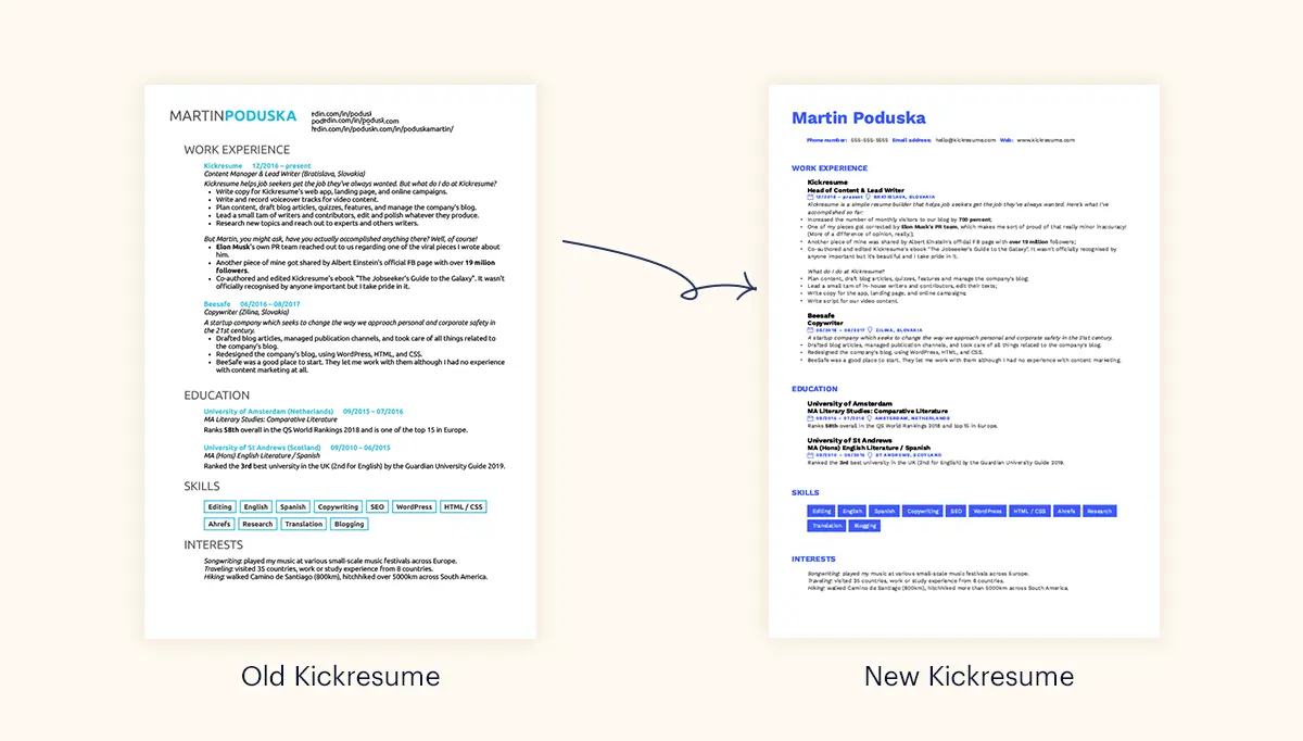
You'd be hard pressed to find better looking resume templates anywhere.
Do you know that feeling when you visit a website that's all text, no pictures, but it makes you experience all kinds of emotions and you're like: "Wow! This looks beautiful!"
That's what good typography can do. It's also the kind of reaction we wanted all recruiters to have when seeing your new resume created with Kickresume.
Two weeks after the soft launch, it's beginning to seem like we succeeded. Your reaction was overwhelmingly positive despite the fact that people usually don't like change.
But none of that would be possible without an incredibly talented team of typographers, graphic designers, web developers, and even data analysts.
How did we come up with these new resume templates?
First, we had a data analyst analyze how you use our resume templates. We asked questions like: Do people in different industries prefer different templates? What customization options do they most frequently use? And so on.
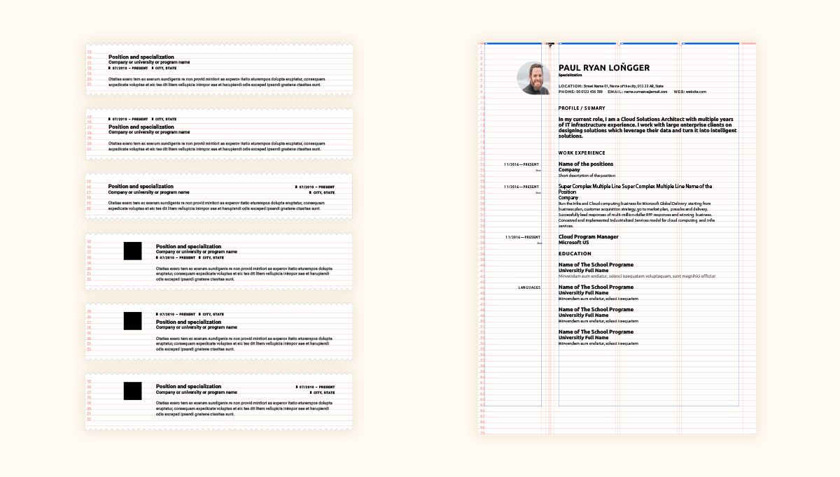
Based on this information, we had a typographer (his name is Martin and he's got an incredibly keen eye for detail) redesign all our templates. He adjusted the typefaces, line heights, spacing and margins, and all the little details that make text easily readable and beautiful to look at. It's the same person who designed our new logo (but more on that later).
Finally, our team of developers, who have been with us for since the very beginning, overhauled the PDF rendering engine and turned all these designs into reality. It was no simple task but here we are — it's real!
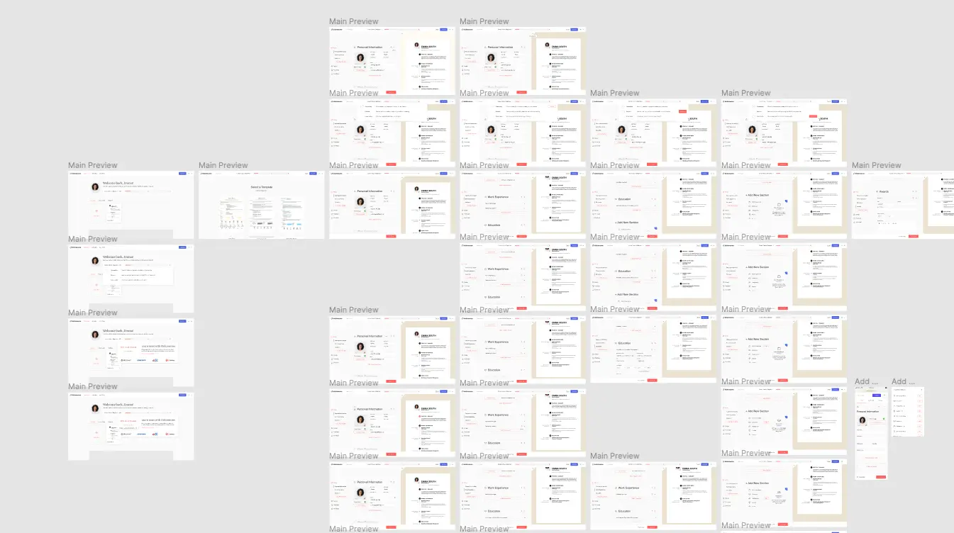
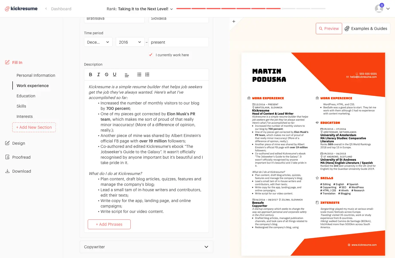
Thanks to the live preview, you can now see everything inside a single screen.
One of your most frequently brought-up issues with the old Kickresume was its lack of live preview. Naturally, it was the first thing we knew we had to include in the new Kickresume.
But we didn't want to stop there.
Our goal was to streamline the entire user experience. Of course, we didn't want to "fix" anything that wasn't broken. Because of that, the new user interface is more a natural evolution than a revolution.
Be it as it may, the new user interface has been given a new, cleaner look which is more in line with our new visual identity.
It also lets you see more information inside a single screen. You don't have to leave the editing screen to make changes to any part of your resume.
In the end, the new Kickresume is easier to use than ever, faster than ever, and better looking than ever.
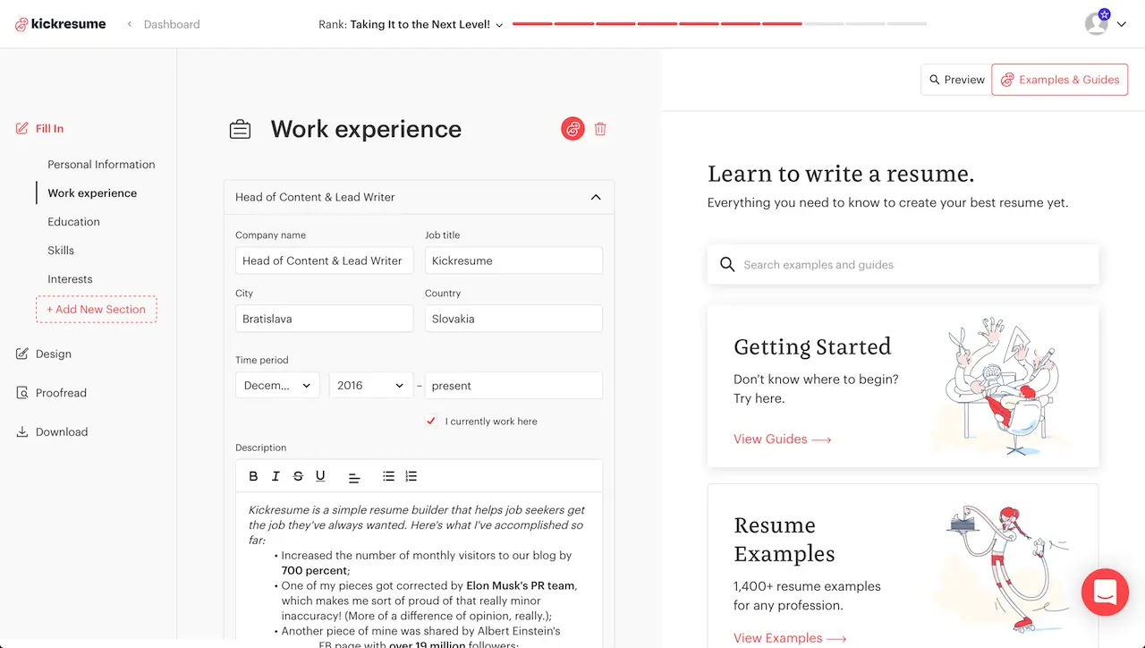
Learn to write a perfect resume from inside the resume builder.
Now you can access our resume guides from inside the resume builder. Simply click "Examples & Guides" in the top-right corner to switch from the live preview to our integrated career center.
You can also access the individual section guides by clicking the friendly Kick button next to each section while editing your resume.
We didn't want you to get distracted from writing your resume. After all, it takes a bit of an effort and willpower to sit down and start writing. Any distraction can ruin that. We really hope that now it will be a bit easier for you to remain focused.
In addition to that, we wanted the resume builder itself to lead you through every step of creating your resume. Having to switch through different tabs just to access a guide always seemed a bit unnecessary. Now you've got everything in one place.
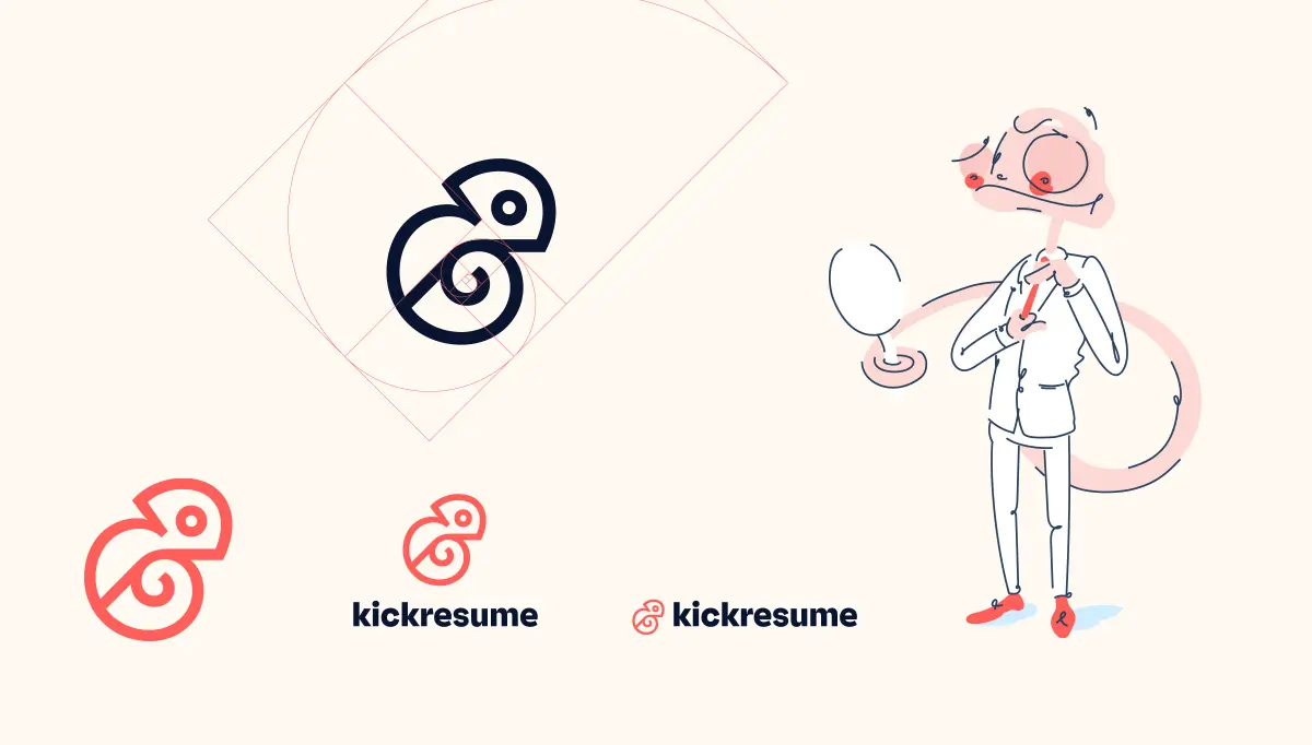
Meet Kick — your personal career assistant.
Speaking of Kick...Do you remember our old logo? The good old upper-case K has accompanied us since the very beginning six years ago. On the other hand, it has always looked a bit basic and at some point we began to feel like it's time to leave it behind.
In other words, we wanted a new brand that would better communicate the essence of Kickresume. We also thought it would be fun and exciting to come up with something new!
Our friends at Echt Creative Community helped us do just that. They also "introduced" us to Kick. He's a chameleon and he represents everything we aspire to be and more!
Not only is he inside our new logo, you can find him everywhere inside the resume builder and who knows, sometimes he also likes to help our customer support colleagues to help you!
Having said that, Kick is still new to Kickresume and he's got a lot to learn. Fortunately, he's a quick learner!
Your privacy is (still) paramount.
We've also improved the protection of your data, which now meets even higher industry standards. A leading security firm (we cannot name it due to confidentiality) did a thorough security audit of Kickresume, penetration testing, and so on. Kickresume passed the audit with flying colors and no data was compromised.
We've also beefed up our infrastructure to handle the ever growing traffic to our website, and obtained an SSL certificate from Digicert.
What's more, since we're based in the European Union, we're bound by the General Data Protection Regulation (GDPR). Put in more practical terms, we cannot share your data with third parties without first getting your informed, explicit yes.
We're not the kind of people who would shamelessly betray your trust. You, as paying customers, allow us to work in jobs we love. All we want is to help you achieve the same thing.
What's next for the Kickresume redesign?
Just like with every large project, there are many details and improvements we have yet to implement.
In the upcoming weeks, Kick is going to get more capable (he's still learning). We're also going to give the interface and resume templates another layer of polish. Oh, and we're already thinking about how we can reorganize our resume guides in a more practical way...
There's a lot. Still, this whole redesign projects has been a fantastic ride and we're truly in love with the result.
We hope you like the new version of Kickresume as much as we do. Thank you for sticking with us all these years and stay tuned for more! ❤️

Level up your job application game even more by exploring our expertly-crafted resume samples.
