A resume header is more than just your name and contact details. Depending on your career path, there's a lot more that can (and should) be included in this section.
While the principle of 'less is more' often rings true, you also don't want to leave out a crucial detail a recruiter might hope to find.
Your header serves as a snapshot of your identity, providing immediate access to your essential personal and contact information, and sometimes, it even showcases your picture.
Wondering what makes a good header for a resume? Searching for some stellar resume header examples? Or perhaps you are looking for a tool to format the resume header for you? You're in the right spot.
In this guide, we'll walk you through crafting a header for your resume that strikes the perfect balance between essential info and simplicity.
What is a resume header and why do you need it?
The resume header is a section right at the top of your resume, which is usually graphically separated from the main content of the resume. It's the first of the resume sections, and it's usually referred to as the contact information section (rather than "resume header").
It’s the space where you should include key information like:
- your name
- address
Plus, there are additional things you can add, like your photo, portfolio URL, or social media profiles. But we'll get to that.
And the purpose of the resume header?
It’s simple: recruiters receive countless job applications, making it impractical to recall (and store) every applicant's contact information.
That's why it's crucial to have this key information prominently displayed on the most vital document: the resume.
So, by providing all the necessary information directly on your resume, recruiters will have no trouble getting in touch with you and invite you for an interview.
What to include in a resume header?
When crafting the perfect resume header, it's essential to differentiate between the non-negotiables and the optional additions.
Some elements are universally expected in every resume header, while others can be tailored based on the job, industry, or your personal preference.
Knowing what to include (and when) can make all the difference in making a lasting impression.
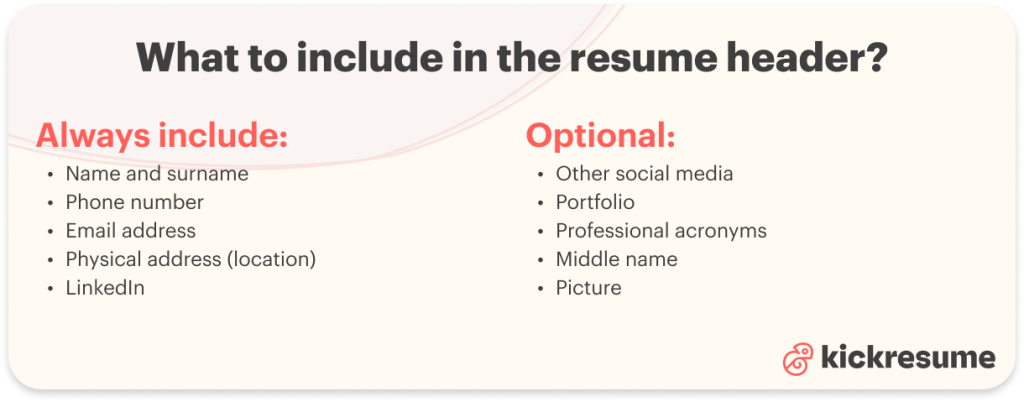
Name and surname
Your name is the cornerstone of your resume header. Make sure it stands out by using a slightly larger or bold font.
Phone number
Including a phone number is crucial for potential employers or recruiters to reach out. If you're applying internationally, remember to add the correct country prefix.
This is a number code that you must add at the beginning of a phone number when dialing from abroad. It represents each country and ensures that the number can be dialed from anywhere in the world.
Here are examples of country prefixes:
- US: +1
- UK: +44
- India: +91
- List of all country prefixes
Not using the correct country prefix when dialing internationally may cause the call to fail.
Email address
Your email is another primary method of communication. Opt for a professional-looking email address; that goofy one from your teenage years might not give the best impression.
Moreover, it's wise not to use your current work email, as its accessibility could change.
Physical address
Including your address on a resume isn't a strict requirement anymore. Why?
Your physical address can offer insights. Employers might have a preference for local candidates or send correspondence through the mail. However, including your home address can also lead to potential biases or discrimination.
To avoid potential biases or discrimination, consider listing just the city and state and naming it "location" rather than "home address." For example:
- Location: Brussels, Belgium.
A full address with a zip code can sometimes be too revealing.
LinkedIn profile
In the digital age, a LinkedIn profile has become almost as standard as a phone number.
When listing your LinkedIn on a resume, here are some tips to keep in mind:
- Customize your LinkedIn URL to eliminate the random letters and numbers. To do this, navigate to LinkedIn > Me > View Profile > Public profile & URL (on the right pane) > Edit your custom URL.
- Use the condensed version of your LinkedIn URL when adding to your resume by omitting the https://
- Alternatively, you can list only your LinkedIn name and hyperlink it. But if you're aiming for a position in a large corporation and have intel that they utilize an ATS, opt for the concise LinkedIn URL since ATS systems remove hyperlinks.
Ensure your profile is updated and reflects your current professional status.
Other social media (optional)
Including social media in your resume can, in many cases, be advantageous and even required.
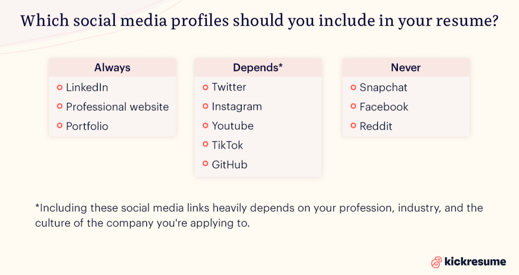
Here's a simple guide on when to add (and when not to add) social media to your resume:
- For everyone: And especially those in the corporate world, always include LinkedIn. It's like an online resume by itself.
- For small companies or startups: Besides LinkedIn, you can add other socials if they show off your personality (in a professional light).
- For jobs anchored in social media: If you're a social media manager or something similar, add any profiles where you've done work-related stuff. Make sure they look professional.
- For creative jobs: Share where your work is. For example, a coder might add their GitHub, and a video creator could add their YouTube link.
The key? Only add profiles that make you look good and fit the job you're applying for. We listed the most popular ones in the picture below:
Portfolio (optional)
Having a portfolio can be a game-changer, especially if you're in a creative field. It's your visual CV, showing off your skills and accomplishments in real life.
How to include your portfolio on your resume:
- URL Method: List the full web address where your portfolio resides. Example: www.myportfolio.com/janedoe in the contact information section.
- Name & Hyperlink: Simply write "Portfolio" and hyperlink it to your portfolio page. This looks cleaner, but remember, some systems might remove the hyperlink.
Always ensure your portfolio is updated, professional, and showcases only your best work.
Professional acronyms (optional)
Your credentials and acronyms are proof of your skills, hard work, and dedication. These can be:
- Certifications: For instance, CPA (Certified Public Accountant) or PMP (Project Management Professional).
- Educational Titles: Such as MBA (Master of Business Administration) or PhD (Doctor of Philosophy).
Including these not only vouches for your qualifications but also sets you apart from other applicants. However, ensure these are relevant to the position you're aiming for and are widely recognized in the industry.
Middle name (optional)
Incorporating your middle name can be a personal preference. Reasons to consider it:
- Clarification: If your first and last names are common, a middle name can help distinguish you.
- Professional Identity: Some may feel their full name conveys more gravitas or formality.
- Consistency: If other professional documents, like publications or certifications, include your middle name, it makes sense to maintain that uniformity in your resume.
However you choose to represent your name, the key is to stay consistent across all professional touchpoints.
Picture (optional)
Including a photo in your resume is a topic of debate, but here's a quick breakdown:
- Cultural norms: In some parts of the world, adding a photo is standard. This includes Asia, Africa, Latin America, and a big part of Europe. However, applicants in English-speaking countries shouldn’t include a resume picture, unless required.
- Industry-Specific: For roles in entertainment or modeling, photos are often expected.
- Bias Concerns: A picture could introduce (un)conscious bias. If unsure, it might be best to omit.
If you decide to add one, ensure it's a professional, high-quality shot. Remember, it’s a representation of your personal brand, so make it count!
Resume header examples
There are countless ways to format a resume header. As the saying goes, "a picture is worth a thousand words."
Instead of delving into heaps of descriptions, let's cut to the chase and provide some visual inspiration.
Note: The following resumes (including the resume headers) were created using Kickresume's resume builder.
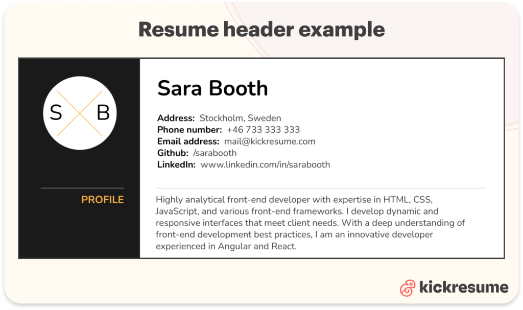
Traditional resume header
Ideal for those eyeing corporate roles. This header radiates professionalism and suits environments that value tradition and formality:
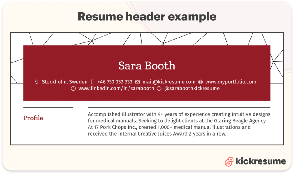
Creative resume header
Tailored for design-centric roles. Here, creativity meets functionality, allowing your unique personality to shine through while maintaining clarity:
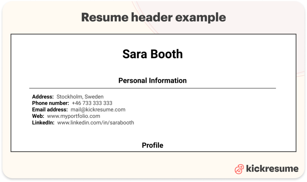
Minimalistic resume header
For those who love all things clean and clutter-free. This style emphasizes a no-fuss approach, focusing solely on the essentials:
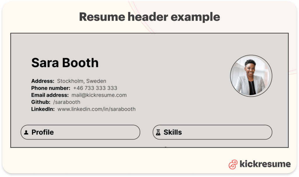
Resume header with picture
A more personal touch, commonly used in certain industries and regions. If opting for this, ensure the photo is a professional, high-quality shot that aligns with the job's nature and cultural norms.
Here's an example:
How to create a resume header
Crafting a polished resume header doesn't have to be a Herculean task. With the right tools at your fingertips, you can design a resume header that stands out.
Let's walk you through two common tools:
- Kickresume (resume builder). This platform offers 40+ pre-designed templates where the resume header is already there. You simply select a template that aligns with your desired style and input your details in the designated areas. When logged in, on the dashboard scroll down to Your Documents and click on Create New.
- Google Docs (online text editor). The good thing is that if you have a Google account, you can access Google Docs immediately. When in Google Docs, in the selection banner at the top, select Resume. Now you can edit this pre-defined template. However, you only get one template to play with.
Final formatting tips for resume header
Now that you've created your header, let's ensure it's polished to perfection. The right formatting can make your header pop and leave a lasting impression on recruiters. Here are some essential tips to guarantee your header shines:
- Use of color. A dash of color can differentiate you from the crowd. But remember, subtlety is the key. Choose a hue that's professional and complements your resume's overall design.
- Utilizing whitespace. Whitespace isn’t wasted space. It ensures your header doesn’t look cramped and lets each element breathe, enhancing readability.
- Matching header style with the rest of the resume. Cohesiveness is essential. If you've opted for a modern header, ensure the rest of your resume mirrors that vibe. Similarly, a traditional header should be paired with a classic resume layout.
- Consistent font usage. Stick to 1 or 2 fonts for the entire resume. This ensures readability and presents a harmonized look.
- Opt for a clear hierarchy. Your name should be the most prominent, followed by other details in decreasing order of importance. This guides the recruiter's eye naturally through the header.
- Keep it updated. Regularly review your header. Ensure contact information is current, and consider freshening up the design if it feels dated.
With these tips in mind, your resume header will not only look professional but will also command the right kind of attention.
Key takeaways: resume header
The resume header is an indispensable section of every application, so getting it right is paramount for making a strong first impression.
Let's recap the essentials and the options you have to make yours stand out:
Must-include:
- Name and surname
- Phone number (with correct country prefix)
- Professional email
- LinkedIn URL
- Address (at least state and city)
Consider including:
- Professional acronyms and titles
- Middle name
- Other relevant social media links
- Portfolio or personal website URL
- Picture (especially if relevant to the job or culturally customary)
