Resume headings are the unsung heroes of a standout job application. Within seconds, these headings determine if a recruiter will continue reading or set your resume aside.
The right headings make a resume easily skimmable, enabling hiring managers to swiftly pinpoint the information they're seeking.
But here's a critical aspect to consider: In the digital age of recruitment, using improper or unconventional headings can lead to a resume being overlooked by Applicant Tracking Systems (ATS).
These digital systems scan resumes for specific terms and structures, and if your headings don't align, your application might not even reach human eyes.
In this guide, we'll delve into the world of resume headings. We'll explore their significance, the dos and don'ts, and the nuances that can set your application apart.
Why care about resume headings?
Resume headings are the chapter titles of your professional narrative. They break your story into digestible sections, guiding recruiters through qualifications, experiences, skills. and more.
With them, your resume is structured and easy to navigate, ensuring key points stand out.
Yet, it's not just about human readability. Companies often rely on Applicant Tracking Systems (ATS) to scan and sort resumes. These systems hunt for specific keywords, especially in headings.
If your headings are unconventional, you risk the ATS overlooking your resume. And that means a recruiter might never see your application.
Now, while it's tempting to get creative, standard headings have stood the test of time for a reason. Everyone recognizes them, making your resume instantly clear.
But that doesn't mean you can't sprinkle in a touch of originality. The trick is to add flair without straying too far from what's expected.
In a nutshell, resume headings ensure recruiters can easily read your story and that ATS recognizes it too.
What headings should be included in a resume?
Navigating the world of resumes, there are some standard, non-negotiable resume sections you'll come across:
- Personal Information
- Resume Summary or Objective
- Work Experience
- Education
- Skills
These sections form the backbone of any solid resume. However, how you label these resume categories can shape a recruiter's first impression.
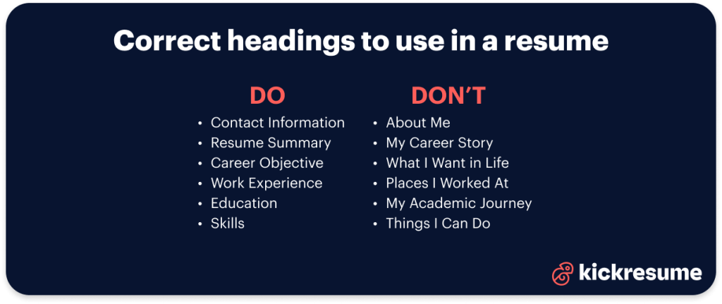
In the following chapters, we'll look at the resume headings for each of these standard sections, highlighting the most effective headings to use, and those best avoided.
1. Personal information
This section offers recruiters a quick way to contact you. It forms the header of your resume and typically includes your name, phone number, email, and sometimes a location or professional profile link (most often it's LinkedIn).
Let's look at the good and bad headings for this resume section.
Good choices:
- Contact Information. Direct and clear, this heading lets recruiters know exactly where to find your phone number, email, and address.
- Personal Information. Just a variation of the above. Still good and to the point.
- Personal Details. Slightly broader, this can encompass the above plus additional info like a LinkedIn profile.
Bad choices:
- About Me. Too vague; it sounds more like a bio or personal statement than a section with contact details.
- Personal Data. This can sound too technical or as if it contains sensitive information.
2. Resume Summary
Your Resume Summary offers a succinct showcase of your professional achievements and skills. In 3-4 lines (or 4-5 sentences) a resume summary details your experience across industries and highlights your key skills and achievements.
Often, it's mixed up with a Resume Objective. However, they serve distinct purposes, and we'll dive into the "Resume Objective" in the subsequent section.
To avoid any confusion about what this resume section is, choosing the right heading is key. Let's have a look at some effective heading options:
Good headings:
- Resume Summary. A brief overview of your career accomplishments and significant skills.
- Resume Statement. Another way to present a concise summary of your professional journey.
- Career Summary. Focuses on the pivotal moments and primary skills in your career journey.
Avoid using:
- Summary of Me. Oh, are we at a coffee shop chatting about life?
- What I've Done. A bit mysterious, isn't it? This isn't a thriller novel.
- My Career Story. Sounds like a bedtime story, but we're aiming to wake up the recruiter with your qualifications!
3. Resume Objective
Your Resume Objective is the little window into your career aspirations. In a few sentences, it reveals your future goals, motivations, and why you're pursuing a specific role or industry. This section is especially valuable for new grads, career changers, or those re-entering the workforce.
Many confuse it with a "Resume Summary." But remember, while a summary showcases your past, an objective reveals your aspirations.
Let's make sure your ambitions aren't lost in translation. Picking the right heading can make all the difference. Here are some ideal choices:
Good headings:
- Resume Objective (or simply Objective). Direct and clear, it indicates your forward-focused career intentions.
- Career Objective. A glimpse into the direction you're aiming for in your professional journey.
- Resume Profile (or simply Profile). Describes where you currently stand in your career path and outlines your aspirations.
Avoid using:
- Dream Job Wish List. A resume isn't a letter to Santa.
- What I Want in Life. Perhaps a bit too existential for a job application.
- Hopes and Dreams. Your career aspirations are important, but let's keep it a tad more professional.
4. Work Experience
The Work Experience is the heart of your resume, painting a vivid picture of your roles, accomplishments, and the value you brought to previous employers.
However, even here, the heading plays a pivotal role. A clear, professional heading ensures recruiters know exactly where to find the details of your professional history.
Good headings:
- Work Experience. The most common headline for this section. No frills. It just works.
- Employment History. A chronological emphasis, laying out the sequence of your roles.
- Professional Experience. A touch of formality, focusing on your professional journey.
Avoid using:
- Jobs I've Done. Sounds more like a chore list than a professional record.
- Places I Worked At. Too casual; this isn't a travel diary.
- My Work Adventures. Sure, work can be an adventure, but maybe not the best way to put it on a resume.
5. Education
As you advance in your career, the Education section may take a backseat to your work experience. However, in fields like academia, law, and medicine, your educational credentials remain paramount throughout your career.
And for instance for fresh graduates, this section often forms the focus point of the resume.
Regardless of its placement or emphasis on your resume, the heading you choose for this section is vital in setting the right tone.
Good headings:
- Education. Classic and straightforward. It's universally understood.
- Educational Background. Comprehensive and clear; it speaks of your academic journey from start to finish.
- Academic Qualifications. Puts emphasis on formal certifications and degrees.
Avoid using:
- Where I Studied. Not a mystery novel's title.
- Learning Journey. Perfect for a memoir, less so for a resume.
- Schooling Adventures. Unless you studied at Hogwarts, perhaps keep "adventures" out of it.
6. Skills
Whether you're flaunting technical know-how, soft skills, or a mix of both, the Skills section can make or break impressions.
Especially when shifting industries or roles, your skills can be the golden ticket. But, as always, a fitting headline is the gateway to this treasure.
Good headings:
- Skills. The simplest choice, and sometimes simplicity is best.
- Professional Skills. Focused, crisp, and clear; it gets straight to the point.
- Strengths. A reflection of both your innate talents and honed skills that differentiate you.
Avoid using:
- Things I Can Do. Sounds like a magic trick introduction, doesn't it?
- My Toolkit. We're not assembling furniture here.
- Stuff I've Learned. A tad informal; let's keep it professional.

Other resume headings to include (or not)
As you continue refining your resume, consider adding supplementary sections that can present a more comprehensive profile of who you are, both professionally and personally.
These optional sections can help diversify your application, showcasing unique attributes or experiences that standard categories may miss.
When deciding to include any of these, ensure they're relevant and can genuinely enrich your resume.
Here's a short rundown of resume headings you might consider adding to make your application stand out:
- Good headlines: Awards, Achievements, Achievements & Awards
- Avoid: Things I Won, Praises & Badges, Accolades
- Good headlines: Certifications, Professional Licences, Courses
- Avoid: Extra Certs, Other Papers I Have
- Good headlines: Publications, Published Works, Articles & Papers
- Avoid: Stuff I Wrote, Things I Published
- Good headlines: Professional References, References, Recommendations
- Avoid: People Who Like Me, My Recommenders
- Good headlines: Interests, Hobbies
- Avoid: Things I Do for Fun, My Play Time
- Good headlines: Social Media, Professional Online Presence, Digital Profiles
- Avoid: Where to Find Me Online, My Internet Hangouts
- Good headlines: Volunteer Experience, Volunteering, Community Service
- Avoid: Places I Helped At, Unpaid Gigs
Resume headings format
Making a good resume isn't just about what you write, but also how it looks. How you format your headings can really catch a reader's eye. But also loose them.
Let's break down how to do this right:
- Font choices. Opt for timeless classics like Arial or Helvetica. Avoid fonts that are too fancy or whimsical; they can detract from your resume's seriousness.
- Size. Consider a size that is larger than the body text but doesn't overshadow the content. For most fonts, this often means 1-2 points larger than the main text, but ensure it's visually balanced.
- Capitalization. When dealing with multi-word headings, you have a choice. Title Case (Where Each Word Begins with a Capital) is a popular choice, making each word distinct. On the other hand, Sentence case (Only the first word capitalized) offers a modern, streamlined appearance. Whichever you choose, ensure you're consistent.
- Consistency. Whether it's the font, size, capitalization, or any other stylistic choice, ensure that you use the same format across all headings. Uniformity enhances readability and imparts a professional touch to your resume.
Resume headings template
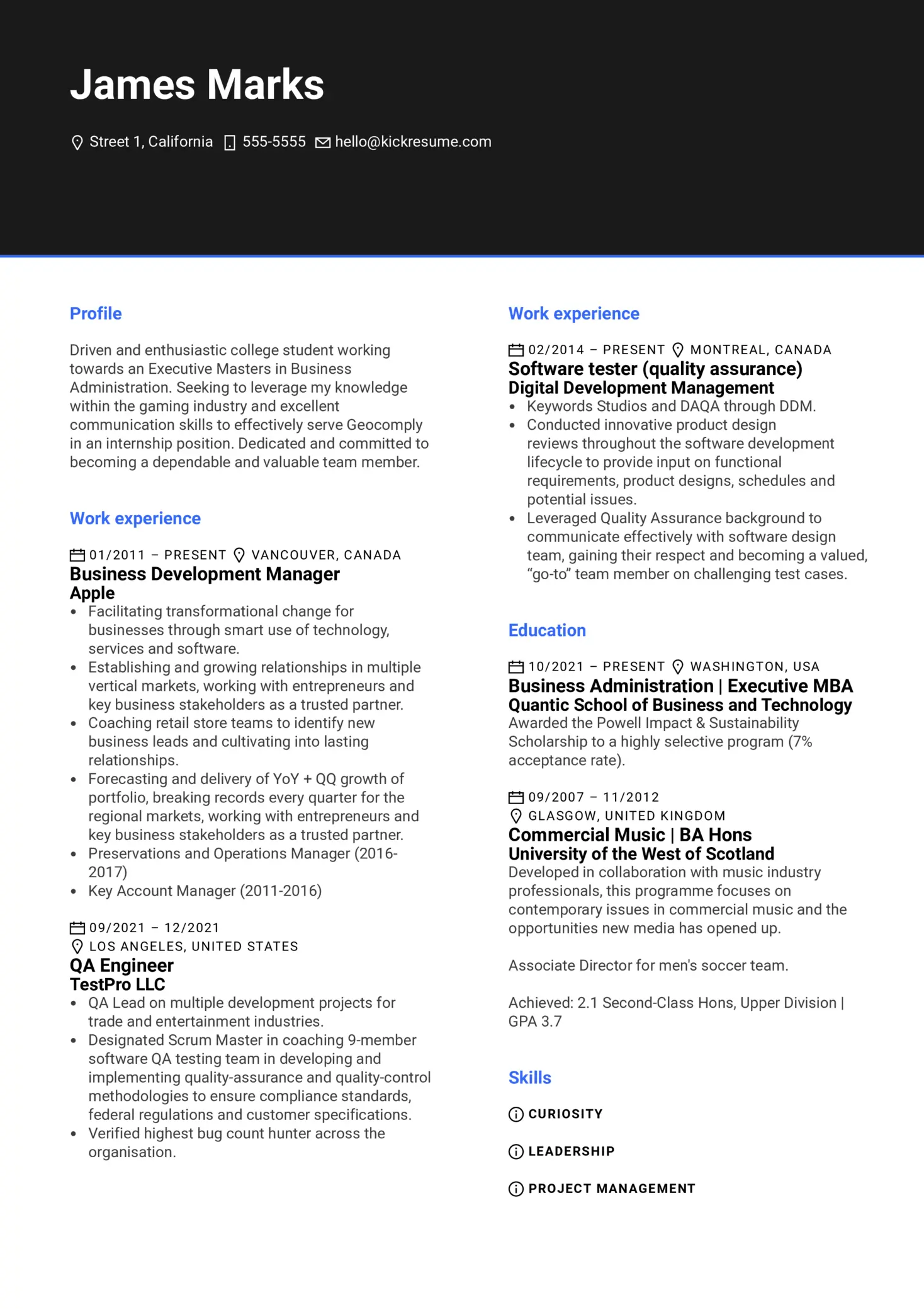
Seeing is often believing. Sometimes, a single picture can explain more than pages of detailed descriptions.
Below, you'll find a visual example of a resume, highlighting well-formatted and neat resume headings. Here's what we like about it:
- Simple and standard headings. Nothing crazy, just the tried and tested classics.
- Sentence case capitalisation. When there's multiple headings, it simply looks neater.
- Font size and color. A slightly bigger size and the blue color nicely separate the headings from the rest of the text and add a nice touch.
Business Development Manager at Apple Resume Sample

This resume was crafted using Kickresume's online resume builder. If you want to create a stunning resume in minutes, tools like Kickresume can be a game-changer.
Key takeaways: Resume headings
With the prevalence of ATS (Applicant Tracking Systems) in the recruitment process, headings play a crucial role in ensuring your resume doesn't get sidelined.
These systems rely heavily on recognizable headings to parse and categorize information efficiently.
Hence, the key thing to remember is that while creativity can set you apart in many areas of a resume, when it comes to headings, it's best to stick to the tried and tested, simple forms. For example:
- Yes: "Education"
- No: "Where I Studied"
Choose your headings wisely and set the stage for a resume that resonates and gets results.
And, if you already have a fantastic LinkedIn profile, you can even convert your LinkedIn profile into resume that is ATS friendly and looks stunning. In seconds.


